Components
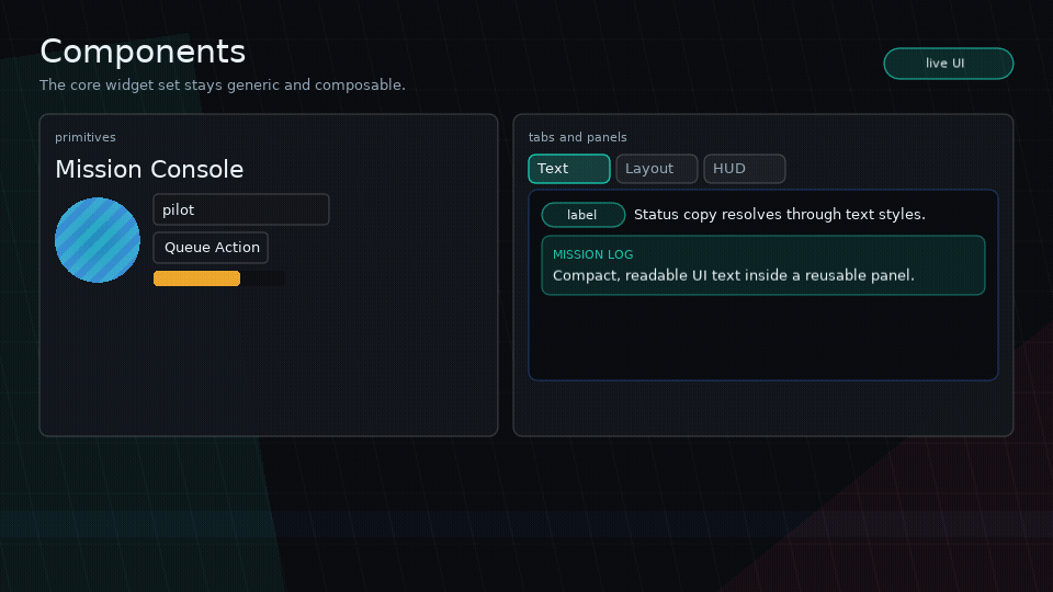
Glyph components return virtual nodes. Components are plain Lua functions; there is no class system.
Text
ui.text("Hello", {
  wrap = true,
  width = 240,
  textStyle = "paragraph",
  style = { color = { 1, 1, 1, 1 } },
})
Use wrap = true with a known width for text that may overflow.
Use textStyle to select a theme typography preset such as h1, h2,
paragraph, caption, or code. Convenience helpers set that prop for you:
ui.h1("Mission Briefing")
ui.h2("Objectives")
ui.p("Hold the zone until extraction.")
ui.caption("Autosaved 4 seconds ago")
Rich/game text is opt-in with ui.richText, which uses the configured SYSL-Text
backend when available:
ui.richText("Status: [color=#7cffae]online[/color] [font=mono]stable[/font]", {
  wrap = true,
  width = 320,
  height = 64,
  textVerticalAlign = "center",
})
textVerticalAlign = "top" | "center" | "bottom" offsets plain or SYSL-backed
text inside an explicit text node height. It is visual-only and does not change
layout, hit testing, or focus geometry.
Configure the backend with an app-provided SYSL module:
ui.richTextBackend.configure({
  sysl = require("slog-text"),
  defaults = { font = love.graphics.getFont() },
  configure = function(Text)
    Text.configure.font_table({ mono = monoFont })
  end,
})
Glyph disables SYSL function commands after configuration by default. Apps that
intentionally want scripting tags should own that risk in app code.
The typography example uses a development copy from dev/vendor; app code should
provide or install its own SYSL module.
For localized text, use ui.textKey after configuring ui.i18n:
Rich localized text uses ui.richTextKey.
Box
ui.box(props, children) is a visual/container primitive. It does not lay out children unless you provide a layout mode with display, or use ui.row, ui.column, or ui.stack.
Image
ui.image(props) draws a Love2D image/canvas-like object that your app has
already loaded. Glyph owns layout, fit, tint, opacity, clipping, and stencil
integration; asset loading stays in your game.
local portrait = love.graphics.newImage("assets/portrait.png")

ui.image({
  source = portrait,
  width = 120,
  height = 80,
  fit = "cover", -- "contain" | "cover" | "stretch" | "none"
  align = "center",
  valign = "center",
  tint = { 1, 1, 1, 1 },
  opacity = 1,
  clip = { kind = "circle" },
  interactive = false,
})
Use quad for atlas cells:
Use ui.spriteSheet when the atlas is a uniform grid:
local sheet = ui.spriteSheet(atlas, {
  frameWidth = 16,
  frameHeight = 24,
})

ui.image({
  source = atlas,
  quad = sheet:quad(12),
  width = 32,
  height = 48,
  fit = "contain",
})
For animated sprite-backed UI, pass anim8 explicitly per sheet or configure it
once through ui.spriteSheetBackend:
local sheet = ui.spriteSheet(atlas, {
  frameWidth = 16,
  frameHeight = 24,
  anim8 = anim8,
})
local glow = sheet:animation({ "1-4", 1 }, 0.12)

glow:update(dt)

ui.image({
  source = atlas,
  quad = sheet:currentQuad(glow),
  width = 32,
  height = 48,
})
If no explicit size is provided, image nodes measure from the quad viewport or
from source:getWidth() / source:getHeight(). Missing sources draw nothing
and measure as explicit size or 0x0.
Vector Path
ui.path(props) draws a Glyph-native vector path. It accepts either normalized
Lua commands or SVG path d data for common path commands. This is SVG path data
only, not a full SVG document renderer.
ui.path({
  d = "M10 70 C40 10 90 110 130 35 Q160 10 180 70",
  width = 220,
  height = 120,
  fit = "contain",
  stroke = { 0.1, 0.9, 0.75, 1 },
  strokeWidth = 4,
  progress = charge, -- 0..1 stroke reveal
})
Lua path commands use normalized command arrays:
local badge = {
  { "M", 8, 40 },
  { "L", 52, 8 },
  { "L", 96, 40 },
  { "L", 76, 92 },
  { "L", 28, 92 },
  { "Z" },
}

ui.path({
  path = badge,
  width = 120,
  height = 120,
  mode = "both",
  fill = { 0.2, 0.5, 1, 0.18 },
  stroke = { 0.55, 0.8, 1, 1 },
  strokeWidth = 3,
})
Supported SVG commands are M/m, L/l, H/h, V/v, C/c, Q/q, and
Z/z. Arcs, gradients, CSS styling, masks, transforms, holes, and winding rules
are out of scope for v1.
Paths can morph between compatible command sequences, or resample both outlines when the shapes differ:
ui.path({
  d = "M10 10 L90 10 L90 90 L10 90 Z",
  morphTo = "M50 4 L96 50 L50 96 L4 50 Z",
  morph = pulse,
  morphMode = "resample",
  mode = "both",
  fill = { 1, 0.7, 0.18, 0.2 },
  stroke = { 1, 0.7, 0.18, 1 },
})
ui.path.parse(d), ui.path.bounds(path), ui.path.flatten(path, opts), and
ui.path.length(path, opts) expose the same parser and geometry helpers for app
code.
Row And Column
Use ui.row and ui.column for normal flex-style flow.
ui.row({ gap = 8, width = "100%" }, {
  ui.input({ flex = 1, value = filter, onChange = setFilter }),
  ui.button({ label = "Clear", onClick = clearFilter }),
})
Grid
Use ui.grid for uniform repeated cells such as inventory slots, cards, menu
buttons, and skill nodes.
Responsive grids use minCellWidth and optional maxColumns:
Use ui.grid.pointToCell(bounds, gridProps, x, y) with onLayout bounds when
drag/drop or pointer selection needs a row-major cell index.
Stack
Use ui.stack for layered UI.
ui.stack({ width = "100%", height = "100%" }, {
  ui.box({ position = "absolute", inset = 0, interactive = false, draw = drawBackground }),
  ui.column({ position = "absolute", top = 24, left = 24 }, {
    ui.text("HUD"),
  }),
})
Later children draw above earlier children unless zIndex changes the order.
Portal
Use ui.portal for floating overlays that should escape later sibling branches
inside the current render root.
ui.portal({
  left = pointerX - 32,
  top = pointerY - 32,
  width = 64,
  height = 64,
  zIndex = 500,
  interactive = false,
}, {
  ui.image({ source = atlas, quad = potionQuad, fit = "contain" }),
})
ui.portal defaults to position = "absolute", zScope = "root", and stack
layout. It is useful for drag previews, tooltips, menus, and HUD callouts, but
it does not create a scene or modal layer.
Button
ui.button({
  label = "Run",
  onClick = run,
  style = {
    background = { 0.1, 0.5, 0.9, 1 },
    color = { 1, 1, 1, 1 },
    hover = { background = { 0.15, 0.6, 1, 1 } },
  },
})
Buttons are focusable by default.
Buttons can resolve labels from i18n keys:
Buttons and other nodes can run triggerable feedback sequences:
ui.button({
  label = "Launch",
  feedback = {
    press = "button.squash",
    release = "button.release",
    activate = "button.pop",
  },
})
See Feedback for sequence steps and app-owned FX events.
Input
Inputs are controlled: keep the value in state and update it through onChange.
Use placeholderKey for localized placeholder text.
Meter
ui.meter(props) draws generic value displays such as health, mana, cooldown,
durability, progress, or debug telemetry. It is intentionally not a game-specific
healthBar component.
ui.meter({
  value = hp,
  min = 0,
  max = maxHp,
  width = 180,
  height = 14,
  shape = { kind = "skew", skew = 12 },
  trackStyle = { background = { 0, 0, 0, 0.35 } },
  fillStyle = { background = { 0.1, 0.9, 0.55, 1 } },
})
Meters support:
kind = "linear" | "radial" | "arc"direction = "right" | "left" | "up" | "down"for linear metersshapefor rectangular, skewed, polygon, circle, ellipse, or blob fillssegments,gap,thickness,startAngle, andendAnglestyle.backgroundandstyle.borderColorfor the track, with clipped fills that stay inside the track shape- radial and arc meters draw open arcs and honor
fillStyle.backgroundorfillStyle.color label, children overlays,trackStyle,fillStyle,overfillStyle, andbackgroundStylelabelKey,labelParams, andlabelCacheKeyfor localized labels
ui.meter({
  kind = "arc",
  value = charge,
  max = 100,
  width = 72,
  height = 72,
  thickness = 8,
  startAngle = math.rad(135),
  endAngle = math.rad(405),
  fillStyle = { color = { 1, 0.8, 0.2, 1 } },
})
Scroll View
Scroll views clamp scrolling to content bounds and support optional scroll indicators.
Tabs
Uncontrolled tabs:
ui.tabs({ defaultActive = 1 }, {
  { label = "Logs", content = LogsPanel() },
  { label = "Stats", content = StatsPanel() },
})
Tabs also accept labelKey:
ui.tabs({}, {
  { labelKey = "tabs.logs", content = LogsPanel() },
  { labelKey = "tabs.stats", content = StatsPanel() },
})
Controlled tabs:
ui.tabs({
  active = activeTab,
  tabWidth = 92,
  tabPadding = { x = 10, y = 4 },
  onChange = setActiveTab,
}, tabs)
Use tabWidth, per-tab width, or tabPadding when tabs should read as a
segmented control with stable button sizes.
Panel
ui.panel is a small convenience component for framed tool sections:
Use titleKey for localized panel titles.
Accessibility Props
All nodes accept semantic props such as role, accessibilityLabel,
accessibilityDescription, accessibilityValueText, accessibilityHidden, and
accessibilityLive. Buttons, inputs, meters, tabs, text, and panels have
best-effort defaults, and semantic strings can use i18n key props. See
Accessibility for adapter events and snapshot APIs.