Styling And Themes
Glyph uses Lua tables for styling, not CSS syntax.
Inline Style
ui.button({
  label = "Run",
  style = {
    background = { 0.1, 0.5, 0.9, 1 },
    color = { 1, 1, 1, 1 },
    borderColor = { 1, 1, 1, 0.2 },
    borderWidth = 1,
    radius = 4,
  },
})
Supported visual fields include:
backgroundcolorborderColorborderWidthradiuslineWidthfontfontSizelineHeightopacitypaddingshaderblendMode
Existing compatibility props such as backgroundColor, borderColor, color, and radius still work, but style is preferred.
Typography
Themes can define a font registry, typography presets, and a global text scale:
ui.setTheme({
  textScale = 1.15,
  fonts = {
    body = love.graphics.newFont(14),
    heading = love.graphics.newFont(24),
  },
  typography = {
    text = { font = "body", fontSize = 14, lineHeight = 20 },
    h1 = { font = "heading", fontSize = 30, lineHeight = 36 },
    caption = { font = "body", fontSize = 11, lineHeight = 15 },
  },
})
font may be a Love2D font object, a registered font name, or a font spec table
such as { path = "assets/ui.ttf", size = 14 }. Font specs are loaded lazily and
cached when Love2D font creation is available.
Text nodes select presets with textStyle:
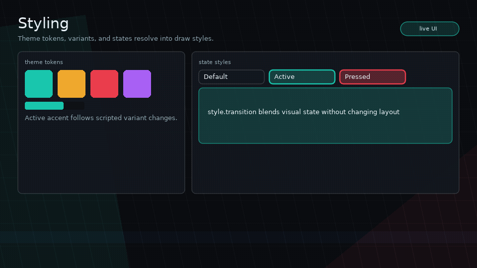
State Styles
State styles are nested tables:
style = {
  background = { 0.1, 0.1, 0.12, 1 },
  hover = { background = { 0.16, 0.16, 0.2, 1 } },
  pressed = { background = { 0.08, 0.08, 0.1, 1 } },
  focused = { borderColor = { 0.4, 0.7, 1, 1 } },
  disabled = { opacity = 0.5 },
}
Supported states:
hoverpressedfocusedactivedisabled
Tabs should use active state styling rather than ad hoc active colors.
Themes
Set a theme globally:
ui.setTheme({
  textColor = { 0.92, 0.92, 0.96, 1 },
  components = {
    button = {
      background = { 0.12, 0.12, 0.16, 1 },
      variants = {
        primary = {
          background = { 0.1, 0.5, 0.9, 1 },
          color = { 1, 1, 1, 1 },
        },
      },
    },
  },
})
Read the current theme:
Variants
Use variant to select component theme variants:
Audio Cues
Glyph can resolve UI audio cue names from theme components, variants, and node props. Glyph only emits cue events; your app owns Love2D sources and playback.
ui.setTheme({
  components = {
    button = {
      audio = {
        hover = "ui-hover",
        press = "ui-press",
        activate = "ui-activate",
        focus = "ui-focus",
      },
      variants = {
        danger = {
          audio = { activate = "danger-confirm" },
        },
      },
    },
  },
})
Per-node audio overrides the theme, and audio = false silences that node:
ui.button({
  label = "Silent",
  audio = false,
})

ui.button({
  label = "No confirm sound",
  audio = { activate = false },
})
Listen with ui.on("audio", handler) and play app-owned sources there.
Style Helpers
ui.style(table)ui.variant(name, table)ui.composeStyles(...)
Transitions
Style transitions are lightweight interpolation tables:
style = {
  background = { 0.1, 0.1, 0.12, 1 },
  hover = { background = { 0.2, 0.2, 0.26, 1 } },
  transition = { background = 0.12, opacity = 0.08 },
}
Style transitions should only mark style dirty unless animating layout fields.
For mount/unmount motion, use node enter and exit animations instead. Those
animations are visual transforms powered by Glyph's vendored flux runner and do
not affect layout or input geometry.
Feedback Vs Transitions
Use state styles for steady interaction appearance, such as hover colors or
focused borders. Use style.transition to interpolate those style fields.
Use enter / exit for lifecycle motion when nodes mount or unmount.
Use ui.feedback for triggerable game-feel stacks such as squash/stretch on
press, a pop on activation, audio cue metadata, or app-owned particle/shake
events. Feedback animation is visual-only and composes with node enter/exit
animation during drawing.