Custom Draw And Helpers
Glyph supports custom drawing on any node through props.draw.
Custom Draw Signature
Arguments:
node: current virtual nodex,y,width,height: absolute drawing boundslove: Love2D modulestyle: resolved stylectx: draw helper context
Draw Context
Useful fields:
ctx.nodectx.propsctx.x,ctx.y,ctx.width,ctx.heightctx.lovectx.graphicsctx.stylectx.runtimectx.hoveredctx.pressedctx.focusedctx.activectx.hotctx.time
Useful methods:
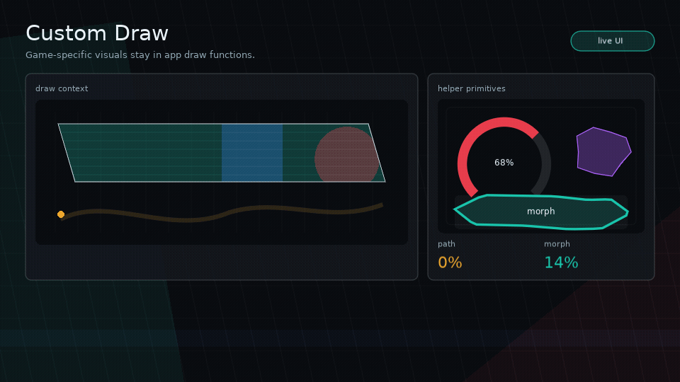
ctx:color(color, alpha)ctx:rect(mode, x, y, width, height, radius)ctx:line(...)ctx:polygon(mode, points)ctx:shape(mode, shape, bounds?)ctx:blob(bounds?, opts?)ctx:clip(shape, fn)ctx:stencil(shapeOrFn, fn, opts?)ctx:meter(bounds, opts)ctx:nineSlice(image, bounds, opts)ctx:path(mode, path, bounds, opts)ctx:text(value, x, y)ctx:printf(value, x, y, limit, align)ctx:pulse(speed, phase)ctx:skewBox(opts)
Example
ui.box({
  width = 240,
  height = 64,
  style = {
    background = { 0.1, 0.1, 0.14, 1 },
    color = { 0.9, 0.95, 1, 1 },
  },
  draw = function(node, x, y, width, height, love, style, ctx)
    ctx:color(style.background)
    ctx:polygon("fill", ctx:skewBox({ skew = 16 }))
    ctx:color(ctx.hot and { 1, 1, 1, 1 } or style.color)
    ctx:text("COMMAND", x + 18, y + 22)
  end,
})
For ordinary images, prefer ui.image over custom draw. It handles fit,
alignment, tint, opacity, clipping, and quads:
ui.image({
  source = portrait,
  width = 96,
  height = 96,
  fit = "cover",
  clip = { kind = "circle" },
  interactive = false,
})
Use custom draw when the image itself needs custom shader setup, multi-pass composition, procedural effects, or app-specific atlas behavior beyond a single optional quad.
Shapes And Stencils
Glyph shape descriptors are plain tables:
{ kind = "rect", radius = 8 }
{ kind = "skew", skew = 18, inset = 2 }
{ kind = "polygon", points = { 0, 0, 140, 10, 120, 64, 8, 56 } }
{ kind = "circle" }
{ kind = "ellipse" }
{ kind = "blob", points = 10, variance = 0.16, seed = "play-button" }
Polygon points are local to the node bounds unless absolute = true is set.
Shape functions may also return local points or a mask/draw function when a shape
needs animation or custom geometry.
Use clip to mask children visually:
ui.stack({
  width = 220,
  height = 120,
  clip = { kind = "skew", skew = 24 },
}, {
  ui.box({
    position = "absolute",
    inset = 0,
    interactive = false,
    draw = drawAnimatedBackground,
  }),
  ui.text("MASKED PANEL", { x = 16, y = 16 }),
})
Use stencil when you want explicit inside/outside masking:
ui.box({
  width = 160,
  height = 160,
  stencil = {
    shape = { kind = "circle" },
    mode = "inside",
  },
}, {
  portraitNode,
})
Note
clip and stencil are visual-only. Layout and hit testing still use the node's
rectangular bounds.
Inside custom draw callbacks, use the same primitives:
draw = function(_, x, y, width, height, love, style, ctx)
  ctx:clip({ kind = "skew", skew = 18 }, function()
    ctx:color(style.background)
    ctx:rect("fill", x, y, width, height)
    ctx:meter({ x = x + 16, y = y + height - 22, width = width - 32, height = 10 }, {
      value = 72,
      max = 100,
      shape = { kind = "skew", skew = 8 },
      fillStyle = { background = { 0.1, 0.9, 0.55, 1 } },
    })
  end)
end
ctx:blob(bounds, opts) returns deterministic polygon points for organic
buttons, panels, masks, and meters:
draw = function(_, x, y, width, height, love, style, ctx)
  local shape = {
    kind = "blob",
    points = 12,
    variance = 0.18,
    seed = "launch",
    phase = ctx.time,
  }

  ctx:clip(shape, function()
    ctx:color(style.background)
    ctx:rect("fill", x, y, width, height)
  end)

  ctx:color(ctx.focused and { 1, 0.9, 0.2, 1 } or style.borderColor)
  ctx:shape("line", shape)
end
Blob, stencil, shader, particle, and splat-style visuals are usually app or example code. Keep the core primitive generic, then layer the visual identity in custom draw and feedback sequences.
Vector Paths
Use ctx:path(mode, path, bounds, opts) for custom vector accents, animated
strokes, icons, route lines, HUD traces, and game-specific frame details.
draw = function(_, x, y, width, height, love, style, ctx)
  ctx:path("line", "M0 80 C60 8 120 152 180 40", {
    x = x + 18,
    y = y + 18,
    width = width - 36,
    height = height - 36,
  }, {
    stroke = { 0.1, 0.9, 0.75, 1 },
    strokeWidth = 4,
    progress = ctx:pulse(0.8), -- 0..1 stroke reveal
  })
end
ctx:path accepts the same options as ui.path: stroke, strokeWidth,
fill, opacity, progress, morphTo, morph, morphMode, samples, fit,
align, and valign. Fill drawing targets simple closed single-contour paths.
Note
Glyph supports SVG path d data, not full SVG files. Arcs, gradients,
document transforms, CSS, masks, holes, and winding rules are out of scope for
v1.
Nine-Slice Frames
Use ctx:nineSlice when a Love2D image should scale like a game UI frame,
window, tooltip, or item slot. Glyph draws the nine patches and caches the quads;
the artwork and style still belong to the app.
ui.box({
  width = 320,
  height = 180,
  draw = function(_, x, y, width, height, love, style, ctx)
    ctx:nineSlice(frameImage, {
      x = x,
      y = y,
      width = width,
      height = height,
    }, {
      border = { left = 12, right = 12, top = 14, bottom = 14 },
      tint = { 1, 0.92, 0.72, 1 },
      opacity = style.opacity,
    })
  end,
}, content)
Pass border = 8 for an even border, or center = false to draw only the
frame. V1 stretches edges and center patches; tiled/repeated edges are left to
app-specific custom draw.
Public Helper APIs
ui.isHovered(node)ui.isPressed(node)ui.isFocused(node)ui.isActive(node)ui.isHot(node)ui.mix(a, b, t)ui.mixColor(a, b, t)ui.setColor(loveModule, color, alpha)ui.time()ui.pulse(speed, phase)ui.polygonBox(x, y, width, height, opts)ui.meter(props)ui.path.parse(d)ui.path.bounds(path)ui.path.flatten(path, opts)ui.path.length(path, opts)ui.customButton(props)
Core Boundary
Use custom draw for game-specific UI. If a widget is visually specific to one game or example, keep it out of core and build it from primitives.