Layout
Glyph uses a small pure-Lua layout engine. The model is explicit and game-friendly, not CSS.
Flow Layout
ui.row lays children horizontally. ui.column lays children vertically.
Common props:
width,heightminWidth,maxWidth,minHeight,maxHeightpaddinggapalign = "start" | "center" | "end" | "stretch"justify = "start" | "center" | "end"growflexshrinkbasisorflexBasis
flex = 1 means “take remaining space” using a zero basis unless width or height is provided.
align controls the cross axis; justify controls the main axis. In a row, justify = "center"
centers children horizontally. In a column, it centers children vertically.
ui.row({ width = 600, gap = 8 }, {
  ui.button({ label = "Fixed" }),
  ui.input({ flex = 1, value = query, onChange = setQuery }),
})
ui.column({ width = "100%", height = "100%", align = "center", justify = "center" }, {
  ui.panel({ title = "Paused", width = 320 }, {
    ui.button({ label = "Resume" }),
  }),
})
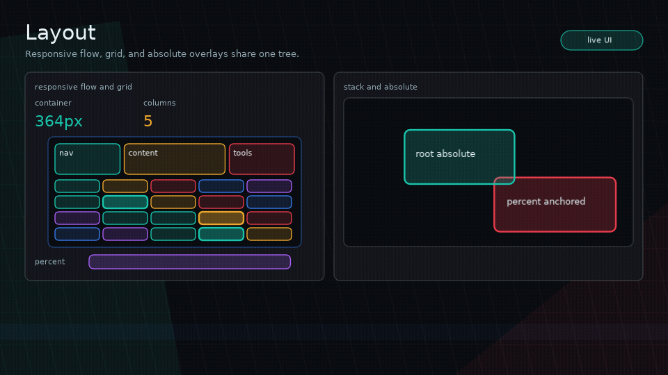
Grid Layout
ui.grid places uniform cells row-major. Use it for inventory slots, card
groups, skill trees, menu pads, and other repeated fixed-format UI.
When minCellWidth is set, Glyph derives the column count from the available
width using the same math as ui.columns.
Grid children are assigned the resolved cell width and height before measuring.
cellHeight defaults to cellWidth. Absolute children are ignored by grid flow
and use the same absolute positioning rules as other containers.
When a parent flex constraint is smaller than the grid's cells, Glyph keeps the
grid's flow size large enough to contain those cells. Put the grid inside a
scrollView or give the parent more height when wrapped rows may exceed the
visible area.
ui.grid is intentionally not CSS Grid: it has no spans, templates, masonry, or
per-child placement in v1.
Use ui.grid.pointToCell with viewport-space bounds from onLayout when pointer
input needs to address a uniform grid:
local bounds

ui.grid({
  columns = 8,
  cellWidth = 58,
  cellHeight = 58,
  gap = 8,
  onLayout = function(nextBounds)
    bounds = nextBounds
  end,
}, slots)

local cell = ui.grid.pointToCell(bounds, {
  columns = 8,
  cellWidth = 58,
  cellHeight = 58,
  gap = 8,
  count = #slots,
}, pointerX, pointerY)

if cell then
  selectSlot(cell.index)
end
The helper returns { column, row, index, localX, localY } or nil when the
pointer is outside the grid, inside a gap, or beyond count.
Percent Sizes
Percent sizes resolve against the parent’s available content bounds.
Stack Layout
ui.stack layers children on top of each other.
ui.stack({ width = "100%", height = "100%" }, {
  ui.box({ width = "100%", height = "100%" }),
  ui.text("Overlay"),
})
Later children draw above earlier children unless zIndex changes the order.
Absolute Positioning
Absolute children are removed from parent flow and positioned within the parent content bounds.
Supported props:
position = "absolute"x,ytop,right,bottom,leftinsetzIndexzScope = "root"for promoted root-level stackingwidth,height, percent sizes, min/max sizes
Examples:
ui.box({ position = "absolute", x = 12, y = 16, width = 80, height = 24 })
ui.box({ position = "absolute", right = 8, bottom = 8, width = 32, height = 32 })
ui.box({ position = "absolute", inset = 0 })
When both left and right are set, Glyph derives width. When both top and bottom are set, Glyph derives height.
Absolute children never affect parent size. Give the parent explicit dimensions, flex, percent size, or normal-flow children.
By default, zIndex only orders siblings within the same parent. For floating
UI that must draw and hit-test above later sibling branches, use a root-scoped
absolute node:
Root-scoped absolute nodes are promoted above the current render root after
normal content, ordered by zIndex, and hit-tested in the same order. Scene
layers still remain separate stacking roots.
For overlays, prefer ui.portal over spelling out the absolute/root-scope props:
ui.portal({
  left = pointerX - 32,
  top = pointerY - 32,
  width = 64,
  height = 64,
  zIndex = 500,
  interactive = false,
}, previewNode)
ui.portal is not a modal or scene layer. It is a named stack-like wrapper for
root-scoped absolute content such as drag previews, tooltips, popovers, menus,
and HUD callouts.
Capturing Bounds
Use node callbacks instead of custom draw callbacks when app code needs
geometry. onBounds reports local parent-relative layout, while onLayout
reports viewport-space layout in the same coordinate system as pointer input.
onLayout includes parent offsets, scene/modal layer offsets, and scroll view
visual offsets. It intentionally ignores visual-only animation, feedback, and
transition transforms.
Text Wrapping
Use wrap = true with a known width:
Text measurement uses Love2D fonts at runtime and test-friendly measurement hooks outside Love2D.
Typography props such as textStyle, fontSize, lineHeight, and theme-level
textScale affect both measurement and drawing. SYSL-backed rich text uses
the textbox get.width, get.height, and get.lines values for layout.
Set textVerticalAlign = "center" or "bottom" when a text node has an
explicit height and the text should sit inside that box instead of starting at
the top.
ui.richText("[font=heading]Alert[/font][newline]Return to extraction.", {
  wrap = true,
  width = 360,
  height = 96,
  textVerticalAlign = "center",
})
Common Pitfalls
- Do not use plain
ui.boxas a stack. Useui.stack. - Do not expect absolute children to size parents.
- Do not use percent size without a parent that has known bounds.