Menori Adapter
ui.menori is an optional adapter for rozenmad/Menori. Menori stays app-provided; Glyph provides scene-layer glue, loading overlays, transitions, screen-space overlays, and interactive world-space UI surfaces.
Setup
local ui = require("glyph")
local menori = require("menori")

local adapter = ui.menori.new({
  menori = menori,
  environment = environment,
})
If feel.menori is available, the adapter reports it through adapter.capabilities.feelMenori and can create a Feel Menori adapter:
Glyph checks passed modules first, then glyph.vendor.feel.menori, then external feel.menori. Menori and Feel remain optional dependencies.
Note
The examples/menori demo vendors a Menori snapshot under examples/menori/vendor
so make menori can run without a separate Menori install. Glyph core still does
not vendor or require Menori; apps pass their own module to ui.menori.new.
Menori Scenes
Use adapter:view when a Menori scene should live inside a Glyph layout region:
adapter:view({
  width = "100%",
  height = "100%",
  scene = scene,
  root = rootNode,
  environment = environment,
  renderStates = {
    node_sort_comp = menori.Scene.layer_comp,
  },
  overlay = function()
    return ui.button({ label = "Pulse", onClick = pulse })
  end,
})
Use adapter.scene when Menori content is the current scene layer:
adapter.scene.set("world", {
  scene = scene,
  root = rootNode,
  environment = environment,
  update = function(spec, layer, dt)
    cameraTarget.values.yaw = cameraTarget.values.yaw + dt * 0.2
  end,
})
adapter.scene.replace uses a Menori-aware crossfade transition by default when a previous view canvas is available.
Loading Overlays
adapter.loading.open creates a Glyph scene layer for progress UI. Loading work is still app-owned.
local loading = adapter.loading.open("loading", {
  progress = 0,
  message = "Loading realm",
  detail = "streaming materials",
})

loading:update({ progress = 0.65, detail = "building world UI" })
loading:close()
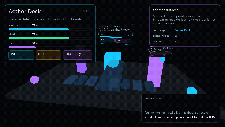
Billboards
adapter:billboard renders a scoped Glyph surface into a Menori plane material. The surface has its own runtime, hooks, focus, feedback, and drag state.
adapter:billboard({
  parent = rootNode,
  environment = environment,
  x = 0,
  y = 1.4,
  z = -0.6,
  width = 260,
  height = 120,
  worldWidth = 1.5,
  inputPriority = "behind-ui",
  component = function(worldUi)
    return worldUi.button({
      label = "Open",
      width = 260,
      height = 64,
      onClick = openPanel,
    })
  end,
})
By default, screen-space Glyph UI wins input. Use inputPriority = "always" for billboards that should receive pointer input even under a HUD. V1 tests registered UI planes only; it does not perform mesh occlusion or physics picking.
Surfaces
ui.surface.new is the generic helper behind billboards. It renders Glyph into an offscreen canvas and exposes local input methods:
local surface = ui.surface.new({
  width = 320,
  height = 180,
  component = function(surfaceUi)
    return surfaceUi.panel({ title = "Terminal" }, {
      surfaceUi.text("independent runtime"),
    })
  end,
})

surface:update(dt)
surface:render()
surface:mousepressed(24, 32, 1)
Use surfaces for world UI, render-to-texture panels, minimap labels, or any app-owned draw path that needs a real Glyph runtime outside the main screen tree.